Accessible documents
Lesson 1 of 8 · about 6 minutes
Use real headings
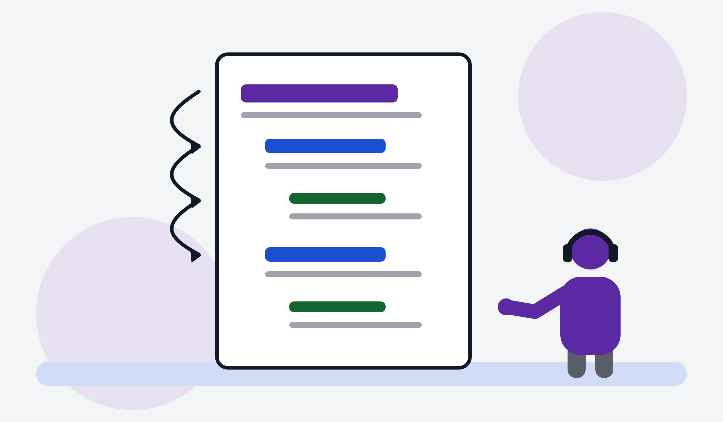
Use the heading styles in your word processor, not bold text. Screen readers use headings to jump around a document. Keep the order: Heading 1, then Heading 2, then Heading 3.
Describe images
Every image needs a short description, called alt text. Say what the image shows and why it matters. If the image is only decoration, mark it as decorative.
Make links make sense
Link text should say where the link goes. "Read the safeguarding policy" is good. "Click here" is not.
Use enough contrast
Dark text on a light background, or light text on a dark background. Avoid grey on white and coloured text on coloured backgrounds.
Keep it simple
Short sentences. Everyday words. One idea per paragraph. Left-aligned text. A font size of at least 12 points, and larger for print.